
Red nails have a problem, and it’s that everyone assumes they know what red nails look like. One flat coat of classic red, done, same as it’s been for decades.
The versions worth booking now use red as a base instead of the whole idea.
Chrome, jelly builds, lace overlays, and negative space all turn the same shade into something completely different.
Here are 21 red nail ideas that go well past the classic manicure!

This website may contain affiliate links. I may earn a small commission if you purchase through the links, at no extra cost to you.
Before You Pick a Red, Check These Four Things
A flat coat of red is the most copied manicure out there, which is why it can look ordinary no matter how good the polish is. The ideas below change how the red behaves, and that comes down to a few choices worth making before your appointment:
- Undertone: cool skin suits blue-based reds like cherry and bordeaux, while warm and olive skin glows in scarlet, brick, and burnt orange
- Finish: chrome, jelly, and matte each turn the exact same shade into a completely different look
- Nail length: detailed work like stained glass and lace needs medium length, while short nails shine with chrome and micro french
- Upkeep: dark reds show chips at the tip first, so plan on refreshing your top coat every few days
Get those right and even the simplest idea on this list will look like it came from a high-end salon.
Glossy and Textured Reds
1. Hyper-Glossy Water Droplets on Blood Red
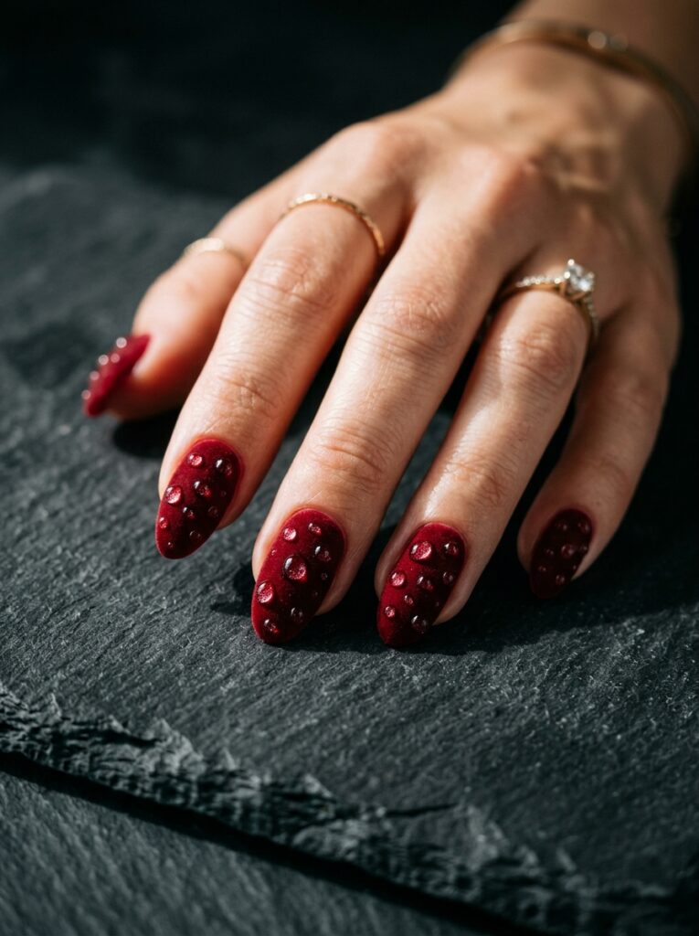
Nothing looks more expensive than a wet-look finish, and raised 3D droplets push it further since they catch light from every angle as your hand moves.
Ask for a velvet matte layer underneath the droplets. Gloss on gloss blends into one flat surface, and the whole effect disappears!
2. Metallic Ruby Chrome With Sculpted Swirls
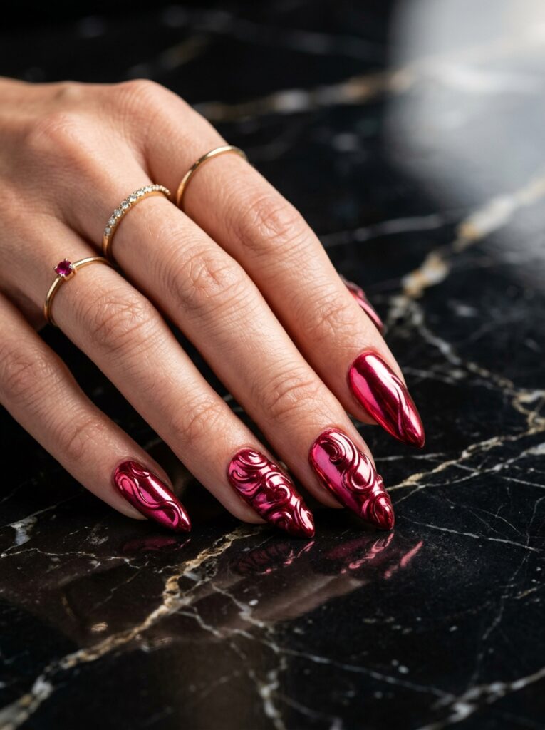
Ruby chrome already shifts color as your hand turns, so sculpted swirls add a second layer of movement on top. What keeps it looking clean:
- Loose, sparse swirls with bare chrome between them
- A deep ruby base under the chrome
- A high-shine top coat over the sculpted texture
- Two or three swirls per nail at most
Dense sculpting buries the reflection you paid for, so less really is more here!
Also read: 14 Jewel Tone Nail Ideas That Look Like Gemstones
3. Matte Brick Red With Glossy Waves
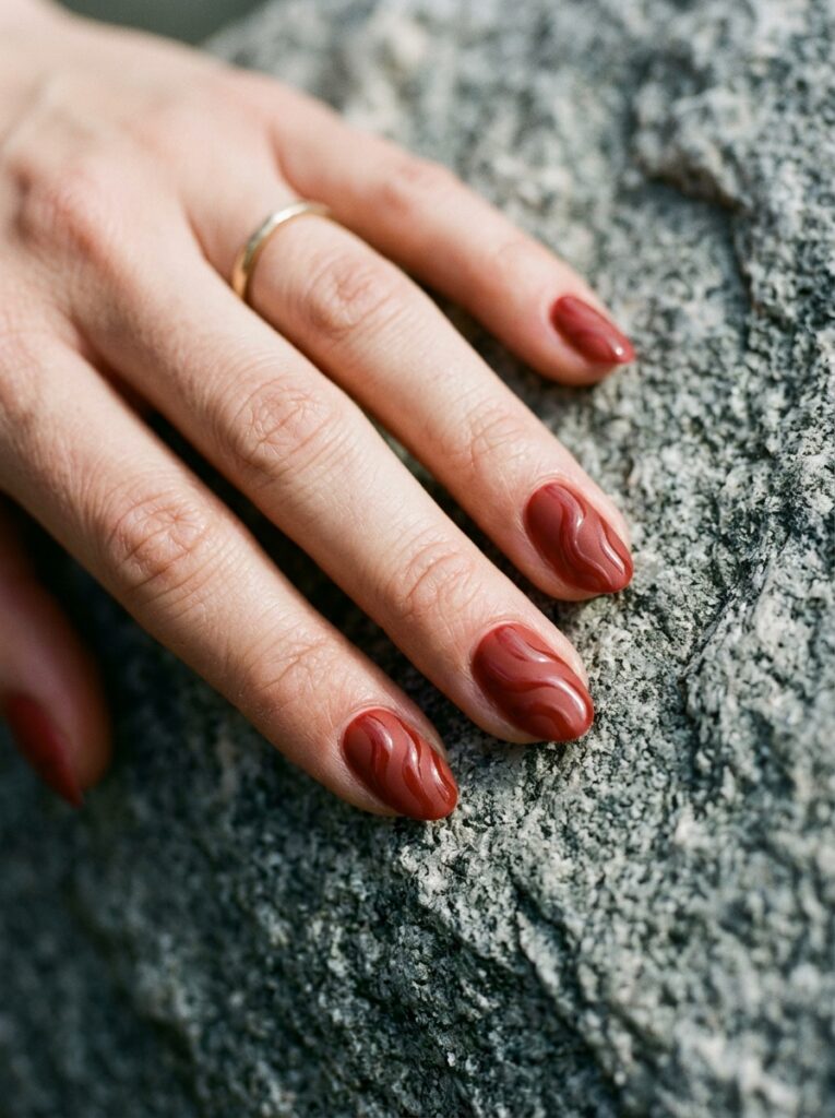
Brick red sits between rust and true red, so it flatters warm and olive undertones equally, and the matte finish keeps it understated.
The glossy waves need room to breathe. Two or three curves per nail is plenty, though running them across every nail works if you like a bolder set.
4. Textured Red Croc-Print Micro French
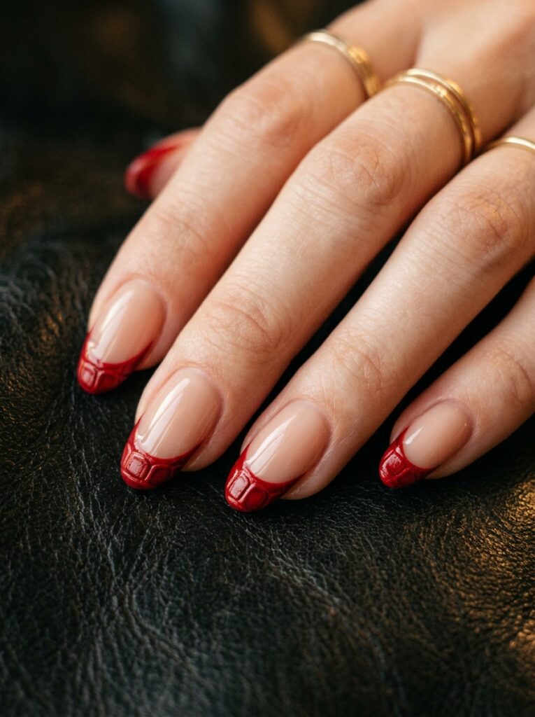
Texture does the work here, since the croc print is embossed into the gel so it catches light instead of sitting flat. What it needs:
- A raised croc pattern pressed into the gel layer
- A thin micro french tip rather than full coverage
- Short to medium nail beds
- A soft-gloss top coat so the texture still shows
Long nails stretch the scales out of proportion, and the print loses the repetition that makes it work.
Also read: 20 Short Square Nail Ideas That Prove Short Is the New Long
5. Abstract Palette Knife Brushstrokes
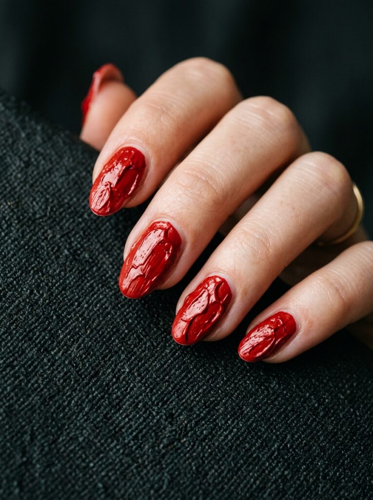
Thick red paint dragged across the nail in visible strokes looks more like a tiny canvas than a manicure, and that’s exactly the appeal.
Ask your tech to leave ridges and bare gaps showing. A smooth, even version defeats the whole idea!
Red With Gold
6. Molten Gold Chrome Drips on Scarlet
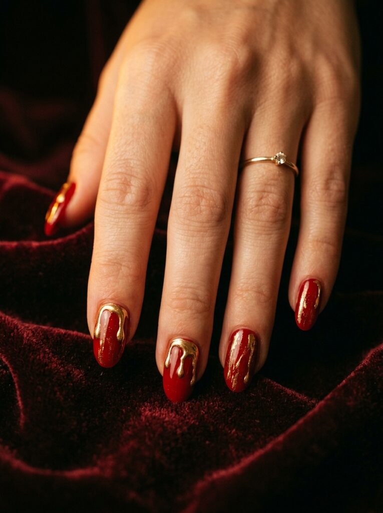
Gold chrome poured down from the cuticle over a deep scarlet base looks like metal still moving, and the pairing works because both shades share the same warm undertone.
Keep the drips to two or three nails, since ten turns it into a plain metallic set.
7. Ruby French Tips With Gold Leaf Inlay
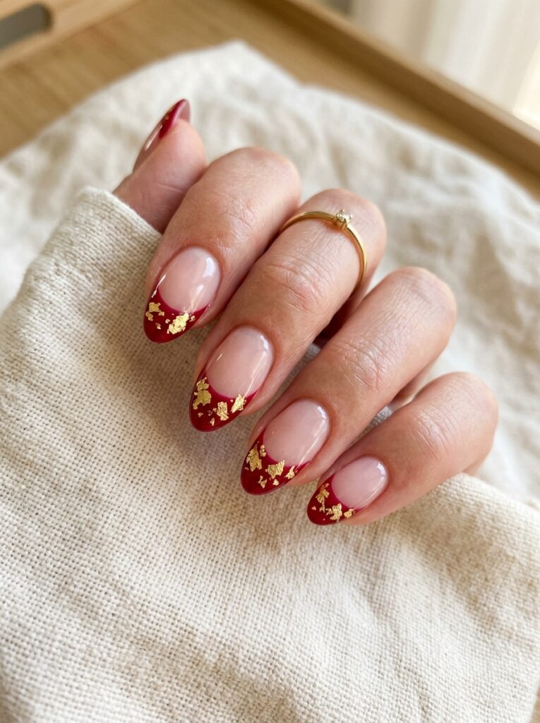
A classic french shape in ruby gets a surprise detail with gold leaf flakes pressed right into the tip. What makes it look hand-done:
- A crisp ruby tip line over a sheer nude base
- Gold leaf scattered irregularly, never evenly spaced
- Flakes pressed in while the gel is still tacky
- A glossy top coat to seal the edges
Evenly spaced flakes look printed, while hand-placed ones always look more expensive.
8. Gilded Edge Minimalist Negative Space
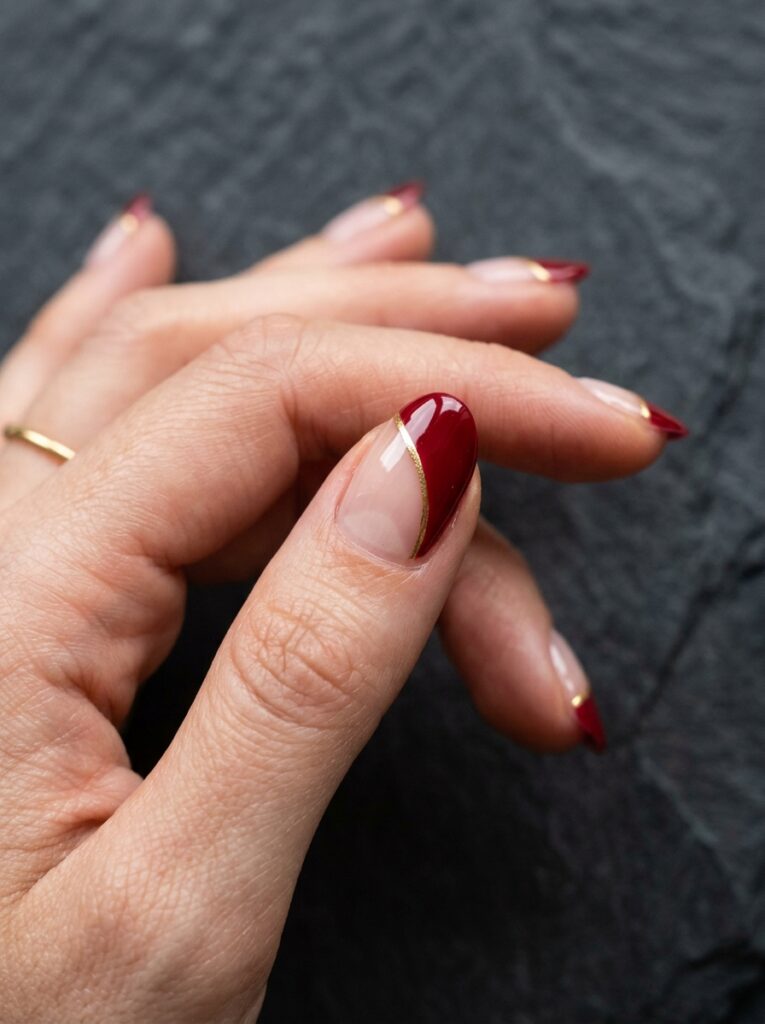
Most of the nail stays bare here, with a single band of red and a fine gold line tracing the edge, and that restraint looks especially polished on shorter nails.
Book a tech who’s confident with a fine liner brush, because a shaky line ruins it.
9. Red Tortoiseshell and Amber Resin
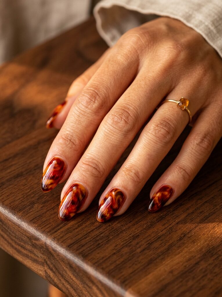
Amber and deep red melted together mimic real tortoiseshell, and layering translucent shades lets light travel through them the way it would through actual resin.
A thick glossy top coat is non-negotiable, since the pattern only looks like resin when the surface is flooded smooth.
Also read: 30 Cute Fall Nail Ideas for 2026 That Are Worth Copying
Fine Line and Detail Work
10. Stained Glass Crimson With Black Lead Lines
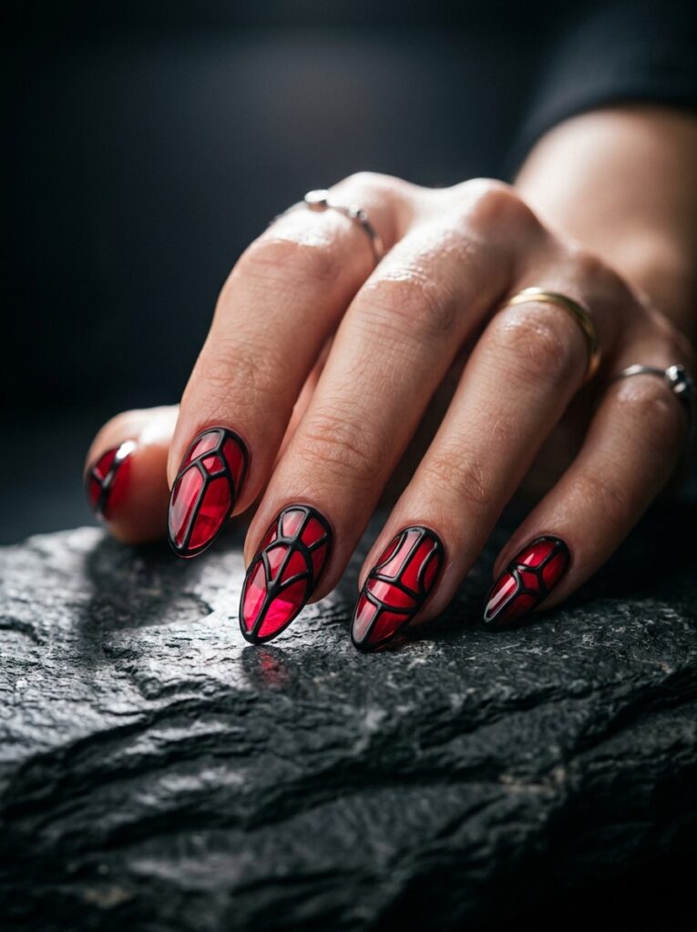
Translucent crimson panels outlined in black borrow straight from cathedral windows. What keeps each panel crisp:
- Bold black lines separating every section
- Translucent crimson fill, never opaque
- Fewer, larger panels on short nails
- A high-gloss top coat to mimic real glass
The black lines do the heavy lifting, since they give the color clean edges to sit inside.
11. Victorian Chantilly Lace Over Jelly
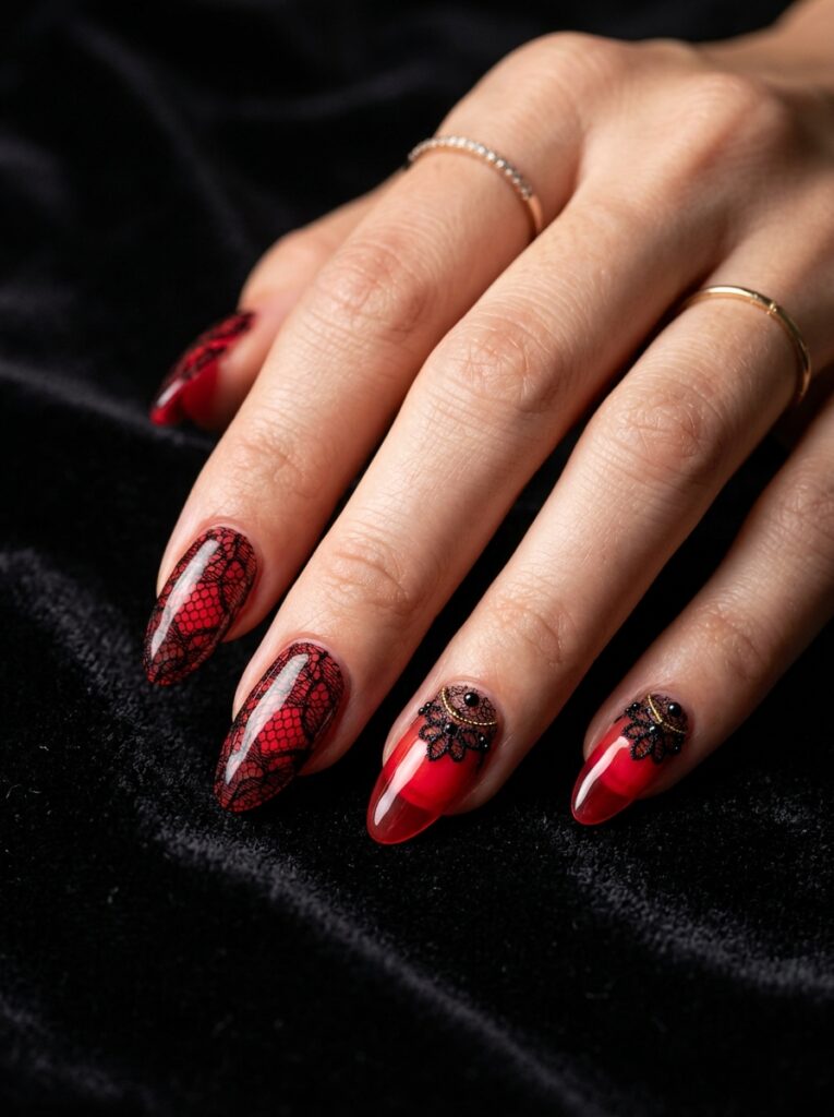
Fine black lace painted over a sheer red jelly gives you depth without opacity, since the red glows through the pattern instead of hiding behind it.
Book extra time for this one. Rushed lacework thickens fast and starts to look like netting.
Also read: 12 Lace Nail Designs That Look Delicate and Expensive
12. Fine-Line Botanical Vines in Carmine
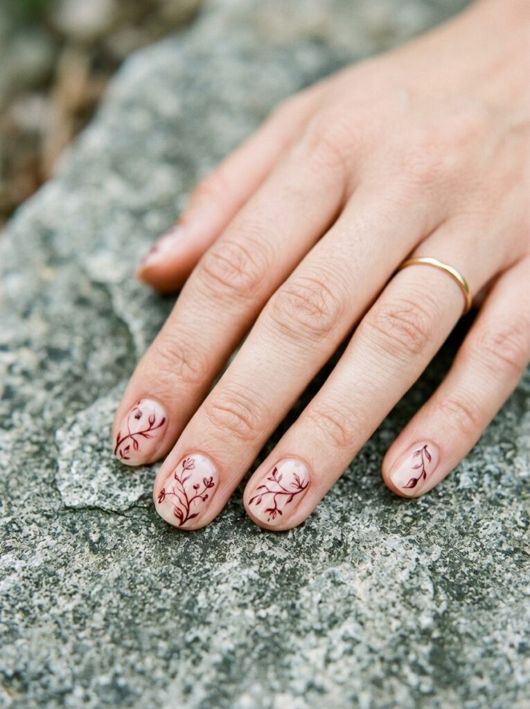
Carmine leans slightly cooler than standard red, which is why fine vine work stays so visible against it. What makes it look hand-painted:
- Thin, delicate linework instead of thick strokes
- Vines running off the edge of the nail
- A different placement on each finger
- A glossy finish to make the carmine richer
A contained sprig looks like a sticker, while a cropped one looks genuinely painted!
13. Blurred Crimson Aura With Starbursts
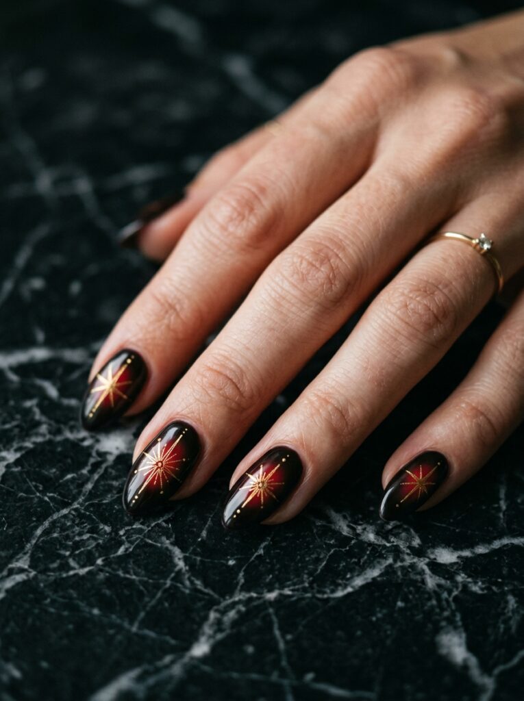
A soft crimson aura airbrushed into the center fades outward with no hard edge, which draws the eye inward and flatters wider nail beds.
Keep the starbursts tiny and uneven, since perfectly spaced sparkles undo the softness the aura took time to build.
14. Red-to-Black Gradient With Constellations
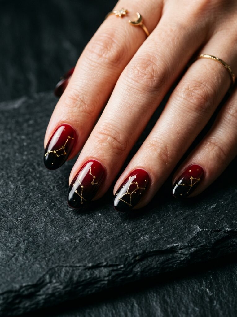
Red bleeding into black gives you a night-sky base, and tiny constellations finish the story. What keeps it looking intentional:
- A low transition so the darkest part sits near the tip
- Constellation dots placed only on the black section
- Smooth, gradual blending between the two shades
- Gold or silver dots rather than white
Dots scattered across the red half make the pattern look random, and the sky effect disappears.
Depth and Dimension
15. Translucent Jelly Cherry With Foil Flakes
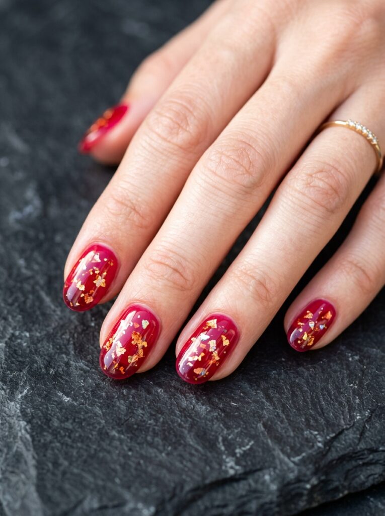
Jelly polish builds color in layers instead of covering the nail, so a cherry jelly stays see-through while foil flakes seem to float inside it.
Three thin coats beat two thick ones. The flakes need to sit at different depths, or the whole illusion flattens out!
16. Deep Bordeaux and Charcoal Smoke Marble
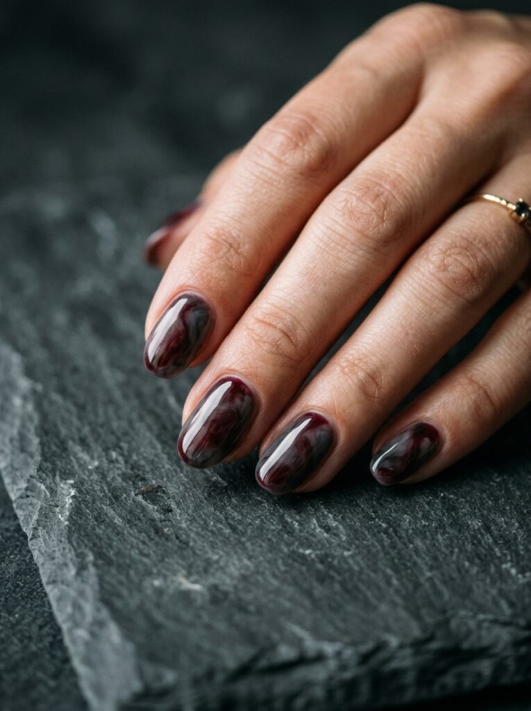
Bordeaux and charcoal swirled together look like smoke caught mid-drift, and both shades share the same depth so neither one takes over. What it needs:
- Loose, cloudy marbling instead of tight veins
- Wide gaps between each swirl
- Equal amounts of both shades
- A soft-gloss finish rather than high shine
Tight veining pulls the design toward stone and away from smoke.
17. Velvet Red Cat-Eye With French Illusion
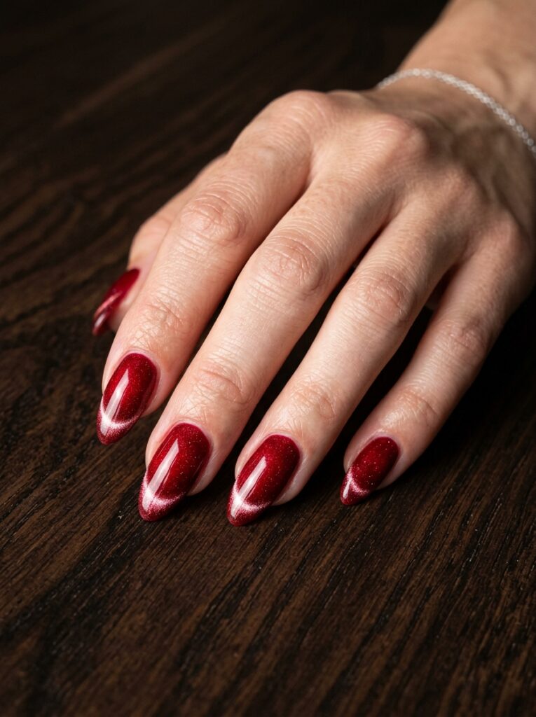
Magnetic cat-eye polish pulls its shimmer into one soft band, and lining that band up along the tip creates a french line made entirely of light.
The placement has to match on every nail. One band drifting off center looks like a mistake across the whole set.
Also read: 20 Stunning Plum Nail Ideas You’ll Want to Save This Fall
18. Scarlet and Burnt Ochre Watercolor Bloom
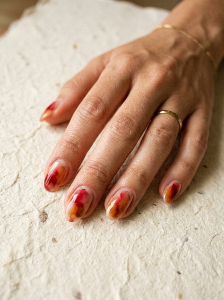
Two warm shades bleeding into each other on a sheer base create soft, blurry edges where they meet. What keeps the watercolor bloom loose:
- Scarlet and burnt ochre from the same warm family
- An off-center bloom on every nail
- A sheer base, never opaque
- No hard outlines anywhere
Warm and olive undertones get the most out of this pairing!
19. Ombré Blood Drip With Micro Pearls
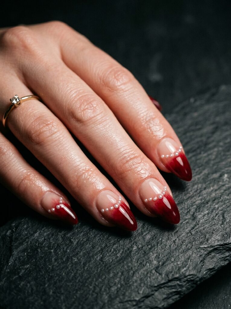
Deep red fading from the tips into a bare nude base keeps this from looking like costume, and micro pearls along the fade catch light where the two shades meet.
Keep the drip edge irregular, since evenly spaced points look stenciled and unplanned always looks better!
20. Negative-Space Asymmetric Graphic Cuts
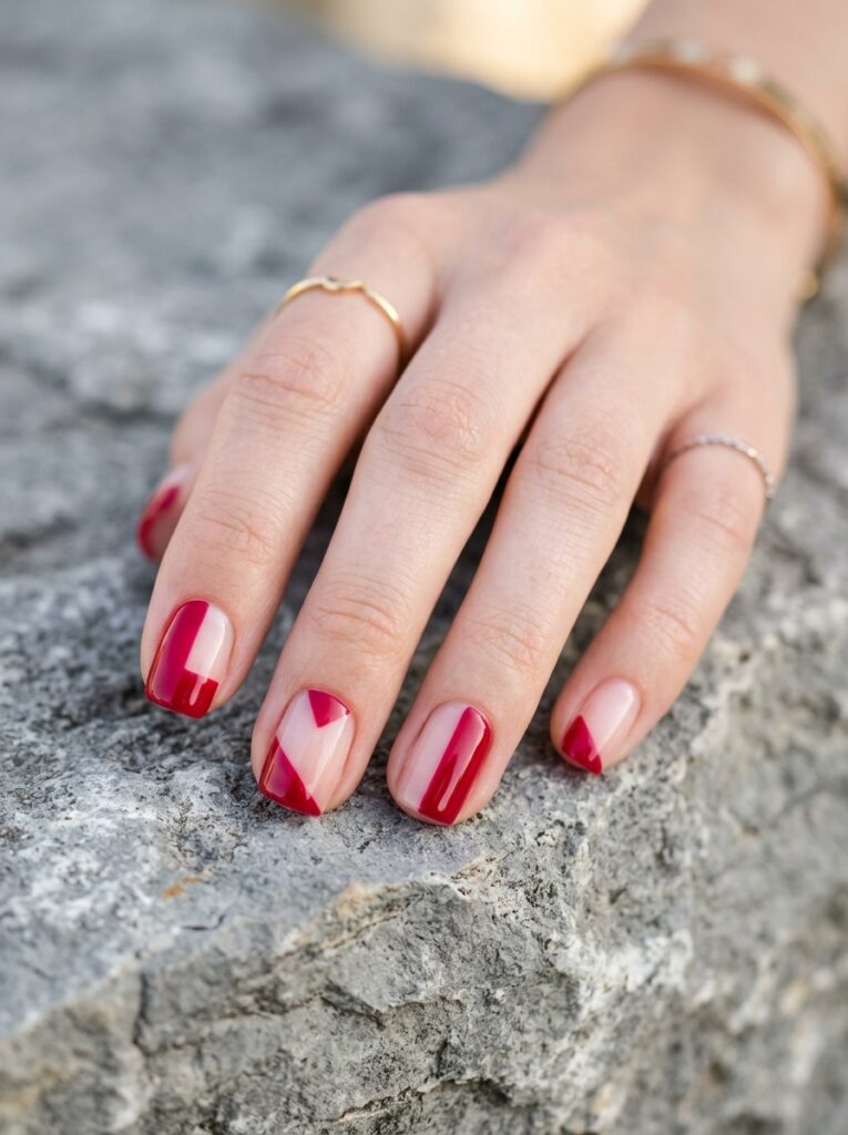
Blocks of crimson sit off-center with clean edges and bare nail in between, which keeps the set modern instead of decorative. What it takes:
- A different block layout on every nail
- Sharp, clean geometric edges
- Negative space left completely bare
- A glossy top coat over the whole nail
Ten matching cuts turn the set into a pattern, so asymmetry is the whole point!
21. Cherry Glazed Donut Chrome
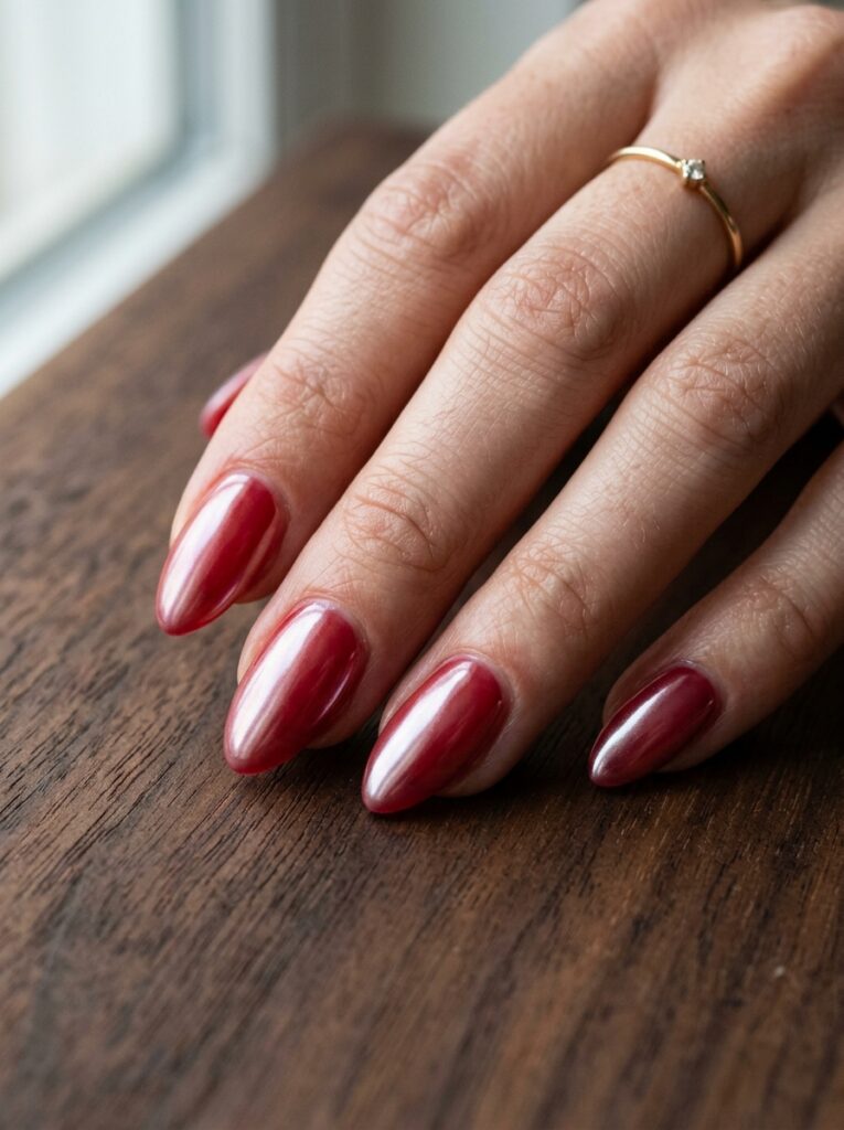
A sheer cherry red topped with pearl chrome powder gives you the glazed donut finish in a warmer, moodier take than the usual milky pink.
It suits short and medium nails equally, and the chrome softens dark red enough for everyday wear!
Conclusion
Red stops being basic the moment the finish does the talking.
Every idea here uses the same shade family as a classic manicure, and the chrome, jelly, lace, or negative space is what makes each one look completely different.
If you want easy starting points, the ruby French tips and the jelly cherry both deliver a lot without complicated work.
Save the stained glass and the palette knife texture for a salon visit, since those two depend entirely on how well the layers get built.
Red Nail Ideas FAQ
Cool undertones look sharpest in blue-based reds like cherry and bordeaux.
Warm and olive undertones do better in scarlet, brick, and burnt ochre shades, since those carry more orange and gold.
Skip the flat opaque coat and build the color as a translucent jelly, or add chrome or gold detail on top.
Depth and light reflection are what separate an expensive-looking red from a basic one.
Short square keeps deep reds proportional to the finger.
Medium almond gives cat-eye, ombré, and aura designs the length they need to show properly.
Deep reds can leave a yellow tint if painted directly onto bare nails.
Always use a base coat first, and remove the polish with acetone promptly instead of letting it wear off.
Cap the free edge with both color and top coat, since the tip takes the most impact.
Refresh the top coat every three days, because dark reds show tip wear before anywhere else.